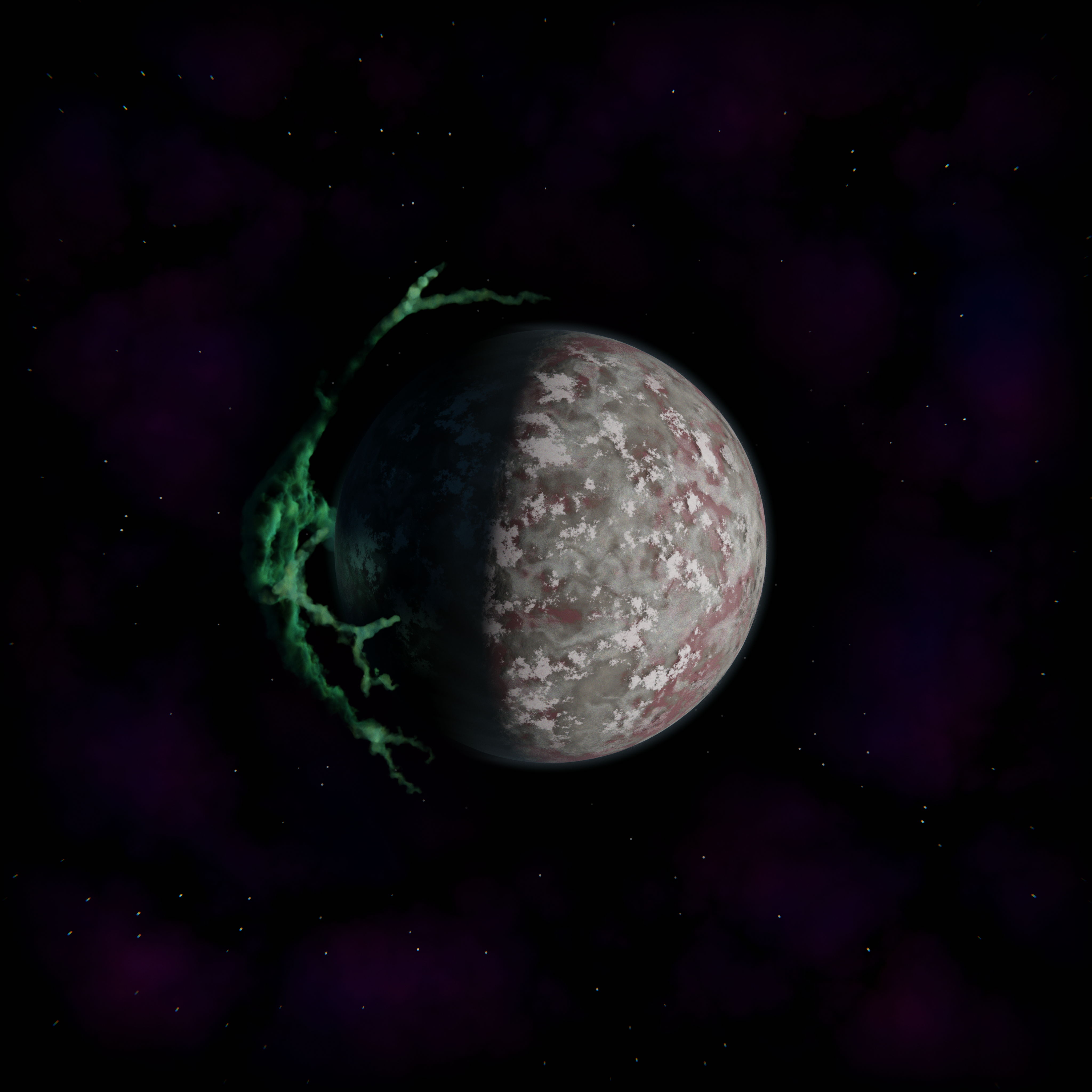
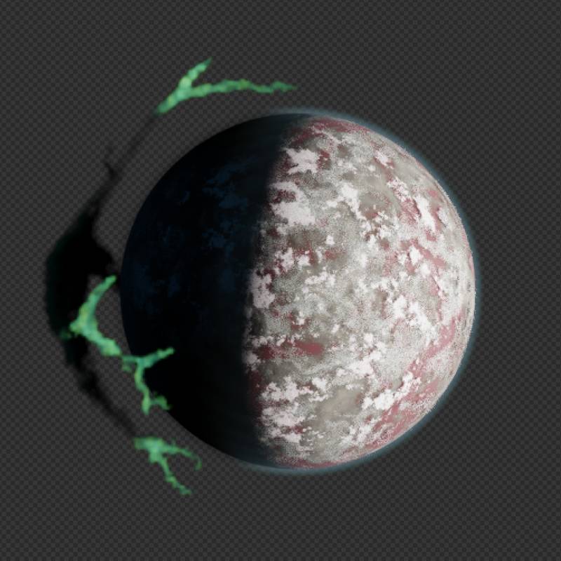
On this page you will find a 4096x4096 image followed by some notes on how it is made. So don’t forget to scroll down.
How This Image Is Made
This is not intended to be a tutorial but if you are a Blender beginner you should be able to follow along and create your own version. I think this is a good project to practice.
Making The Planet
There is a Planet collection in the scene with 4 objects; Ground, Clouds 1, Clouds 2 and Athmosphere. First three objects share the same mesh, but Athmosphere has a separate mesh for shading purposes. More on that later.
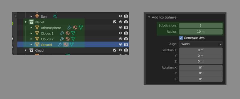
Both meshes are created in the same way; Add -> Mesh -> Ico Sphere, set subdivisions to 3 and radius to 10.
Using a 20 unit diameter sphere for a planet is a rather arbitrary decision. I never intended this scene to look ultra realistic and I didn’t have a clear idea for the final result in the beginning. Ultimately I went for a more stylistic look (more about this in Compositing section). It is generally a good idea to use a scale so that your medium sized details fall in range of [0.0, 1.0) units. That is units as in Blender units, which can be mapped to millimeters or kilometers in Scene -> Units panel.

Back to main topic. As I mentioned before clouds and ground share the same mesh datablock. You might ask; how do they not clip into each other? Here is a render with just those 3 objects visible:
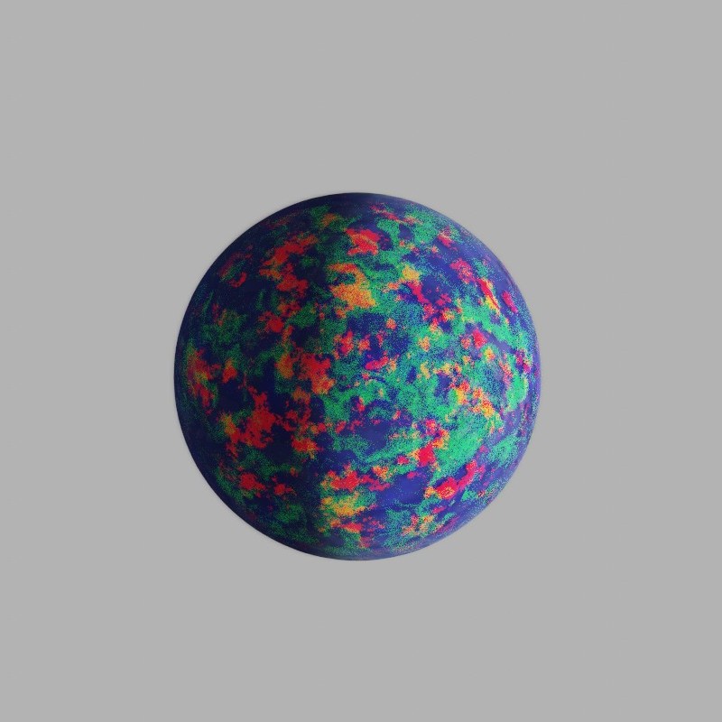
I have changed the materials a bit to enhance readability. In the render above Ground has a blue tint, Clouds 1 has a red tint and Clouds 2 has a green tint. If you look closely you can see clouds casting shadow on the planet surface, they are not same sized. This is achieved by using Displace modifier with varying Strengths.
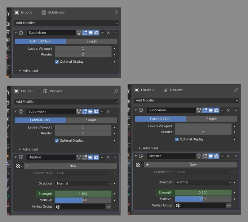
Notice both Displace modifiers have no texture assigned. This way the entire geometry is displaced uniformly. That is Strength times Midlevel. 0.15 for Clouds 1 and 0.25 for Clouds 2. These values are arbitrary, just like the 10m radius I have chosen for the ground sphere. It looked fine, so I went with it. However as I mentioned above it is usually a good idea to be mindful about the scale of things in your scene. Especially for more complex scenes.
To finish our planet there is only one more object to create; Athmosphere. As I mentioned above we cannot just create another instance of our icosphere and use a slightly larger displacement strength. This is because Eeevee cannot fill the mesh’s volume like Cycles does and I used Generated coordinates to spherical volume density gradient. Since our planet’s athmosphere is spherical we are lucky that can use a gradient texture to define its volume.
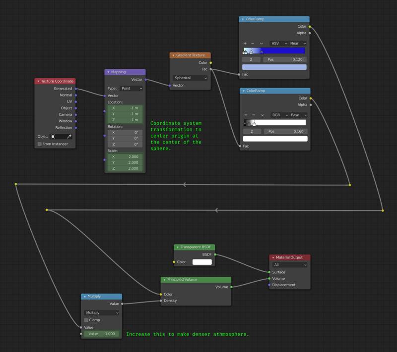
So we use the Generated coordinates and apparently they are not updated (grown) based on the modifier stack (displacement). Alternatively we could have used Object coordinates but that also would not allow us to adjust the size of athmosphere (bounds of the volume rendered) using the viewport. Keep it in mind this all works because our geometry is spherical, if we had a planet shaped like the Stanford Bunny we would need to use volume data (VDB or mesh to volume modifier).
This concludes the planet. Let us look at how the cloud is created.
Making The Cloud
Making the cloud is a bit more complicated than making the planet. Cloud is rendered using volumetrics and to set up the shape of this volume we need a few mesh objects.
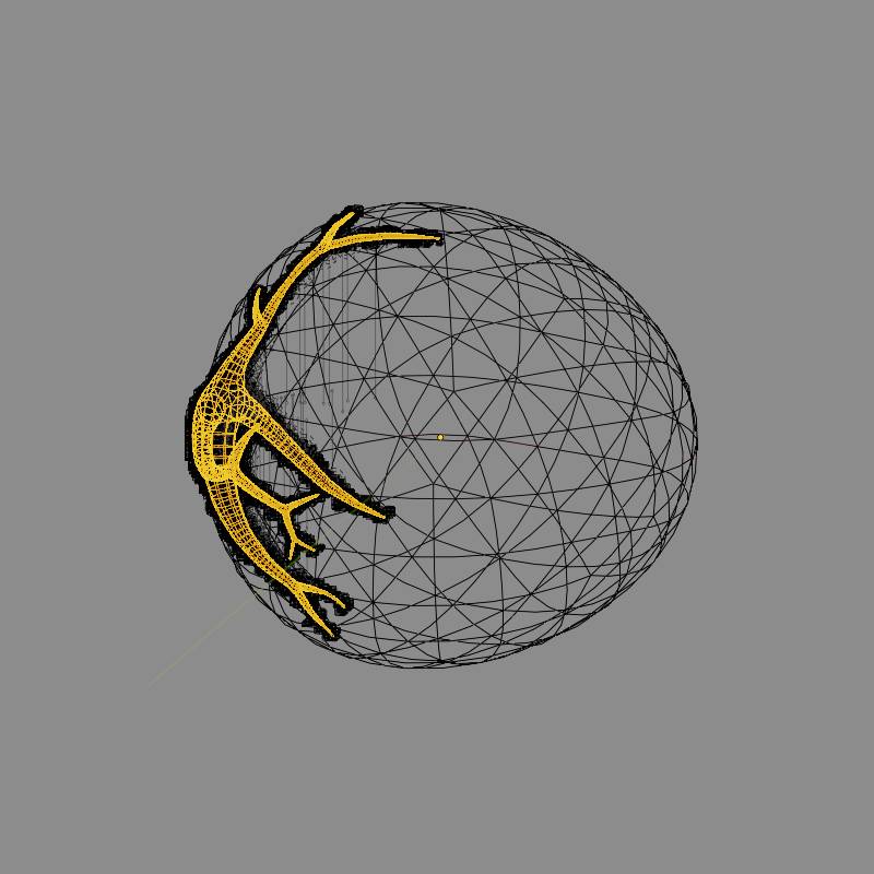
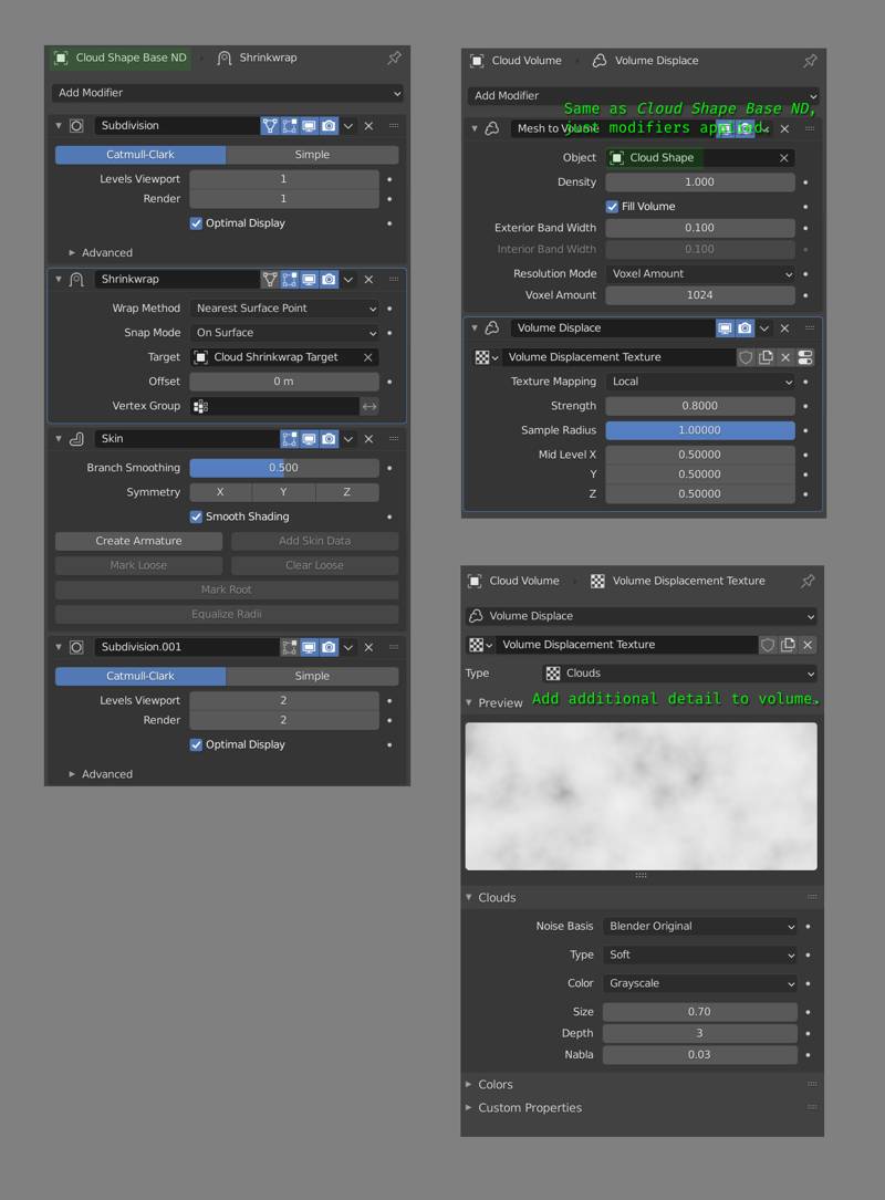
Highlighted object here is the base shape for the cloud. The volume is set up using a Mesh to Volume modifier on a volume object. The base mesh is created using simple edge only structure and applying Skin modifier to create thickness. There is also a Shrinkwrap modifier to constrain the vertices of base mesh to that large sphere-like shape you can see in the image above.
This creates a volume with the shape we want. If we stopped here, our render would look very boring. Boring and all wrong in fact.
To add that juiciness, that oomph factor to our image we need to fix the shading of our cloud volume. Eeeve is reasonably good (and much faster than Cycles) at rendering volumes, but it does not have a realistic enough lighning model (compared to Cycles) so we need to do something unrealistic to make it look more realistic.
Distributing lights over a (invisible) mesh that’s cut-out from the cloud base shape did the trick. This light instancer needs to be offset from the cloud base shape a little bit to get the best results. This is achieved with a simple Displacement modifier with no texture. Lights are instanced using a GeometryNodes modifier on this mesh. Geometry nodes setup is just a Point Distribute node set to Poisson Disk distribution and a Point Instance node.
Of course these extra lights can illuminate the planet’s dark side a bit too much if their intensity is not adjusted properly. In my scene I used 18 Watt intensity but this would mean very little to you as there are so many other factors that determine lightning (such as exposure). You should adjust your instance’s intensity so that it creates a nice effect on the cloud but does not light up the planet’s dark site too much.
Compositing
Background
Initially I had a world background, but I discarded it later for a compositor based background. A compositor based background works since this is a single still render and it is a lot easier to set-up and tweak.
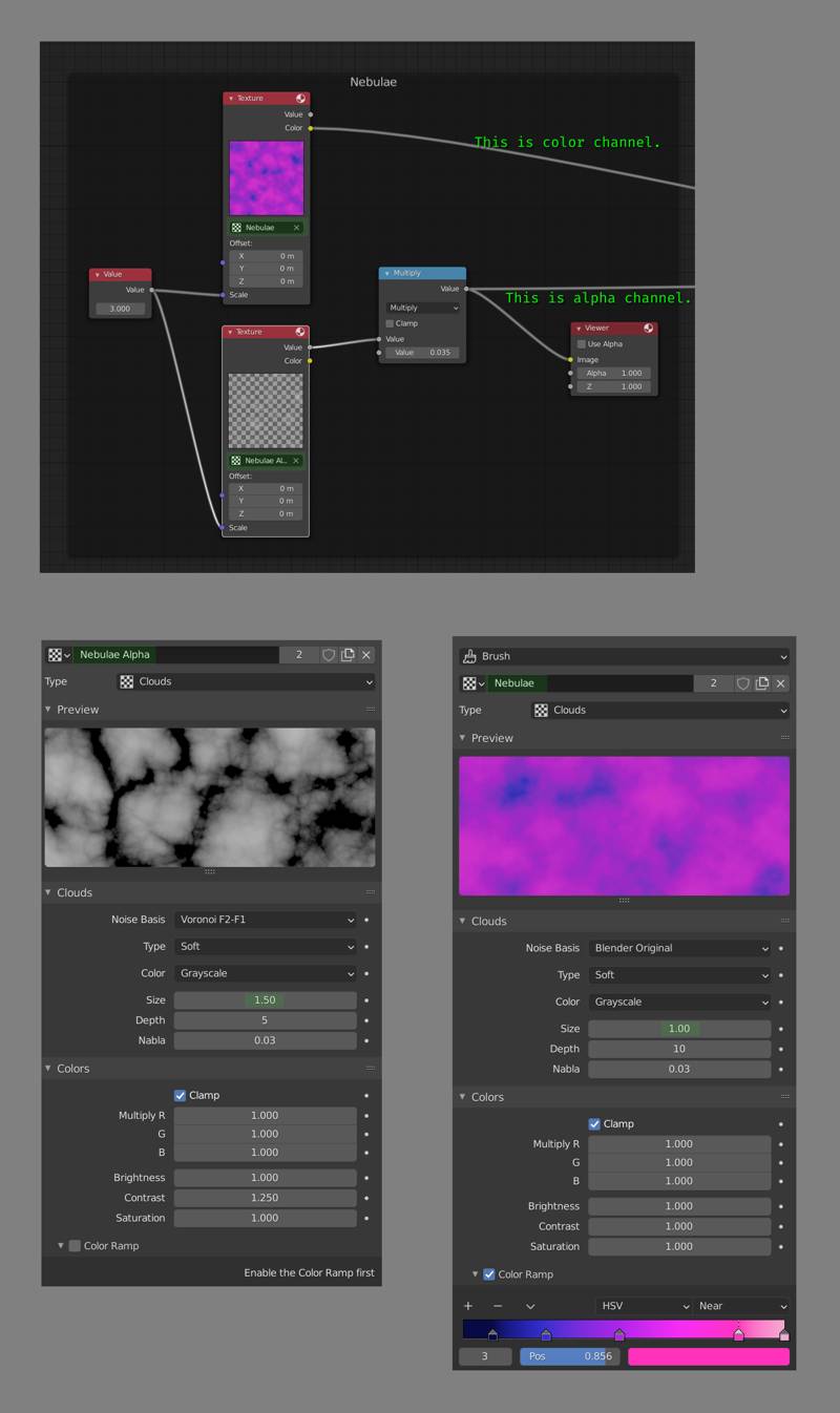
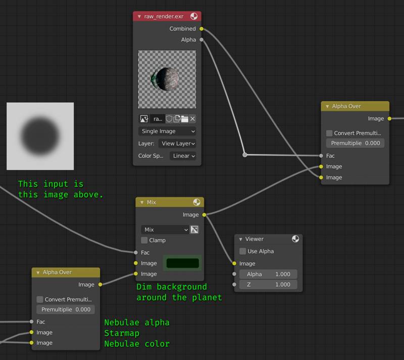
Space is supposed to be dark, so our background should be subtle. Our base layer for the background is just two noise (Clouds) textures with different sizes. One noise texture is used for color channel, and has a color ramp. The other one is used as an alpha, so we do not set up colors for that one. A single noise texture could also be used but it would not have the same level of variation as the combination of two textures.
Making the stars is very easy. We start with a Voronoi texture. It does not look anything like a starry sky. Obviously we can invert this to get large, white blurry points. Adjusting the size of the texture down would make the stars smaller but it would also increase the number of the stars. Making the size larger would reduce the number of stars but make them too big this time. Eventually we would decide to give up making a starfield by just fiddling with texture properties.
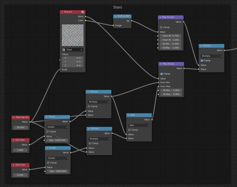
The node setup above might look complicated but it really is not. We are using both the Color (based on the position of the nearest point) and Value (based on the distance to the nearest point) outputs of the texture. Value is used to determine the position of our star, and the color’s intensity is used to add a bit of variation to the starlight’s strength. This version does not vary starlight color. Let us look at how both outputs are used in a bit more detail.
All the math nodes in the bottom part are just to calculate From Max & From Min of the Map Range node that uses value output of the voronoi texture. I wanted to be able to adjust star size and density of the starfield independently (problem I mentioned 2 paragraphs ago), so the math nodes help with that. Trick is to adjust star size when we change the texture size, this is done by multiplying star size values with Starmap Size value. Those two Divide nodes are there only because if we enter a value like 0.0001 in a number field, it gets processed as 0.0001 but displayed as 0.000 in the UI. So those two Divide nodes are there just to avoid confusion. Also note that, in map range node To Min value is 1.0 and To Max value is 0.0. This effectively inverts our texture, from black dots on white background to white dots on black background.
Nodes that use the color output of voronoi texture is quite straightforward. Color to BW is not strictly necessary, it turns the color output into a float output. Map range node is mapping [0.7, 1.0] range to [0.3, 1.0]. In simple terms this means most of the stars will be quite dim (assuming a uniform distribution, 70% of the stars will be of 30% brightness) and few (remaining 30%) stars will have uniformly (linear) distributed brightness values ranging from dim to full brightness. Like I said, it looks complicated but it is not.
Finally we can combine the background with our render. Node setup for this is below. I didn’t include the nodes that generate the mask (shown in the image below) to keep things simple. Note that background’s edges will be further dimmed when we apply the vignette.
Lens Distortion & Film Noise
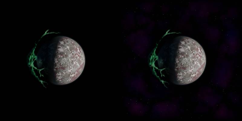
Now that we have merged our compositor-based background and our rendered subject, what is left is to enhance the realism of our image by degrading it. The idea is to make it look less like a render and more like something that’s totally not rendered in a 3D software like Blender.
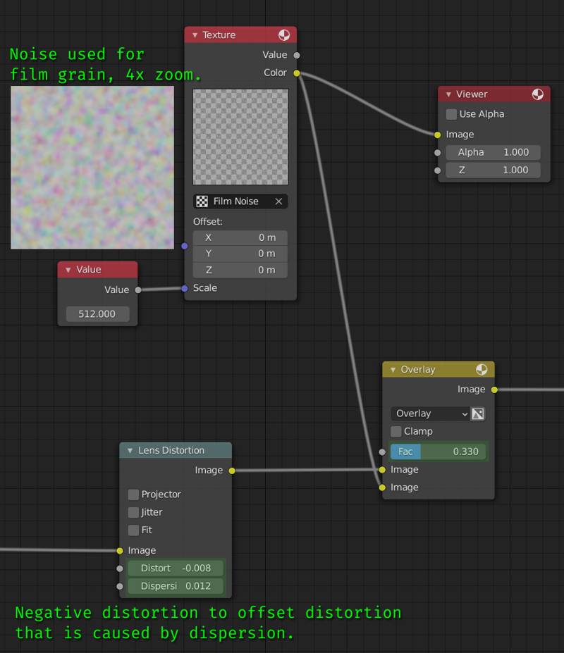
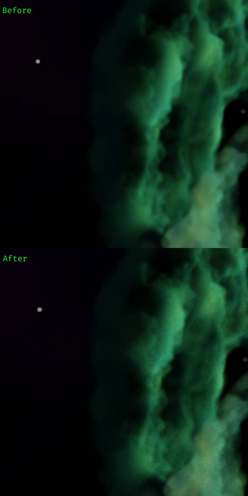
These enhancements make a big difference in believability of your image. But the key is to keep these effects very, very subtle. You can find a comparison of these two effects applied vs our image with only the background (2x zoomed):
Vignette
You can see the nodes used to create the vignette below. It is basically a blurred box mask, applied with Multiply blend type over the image.
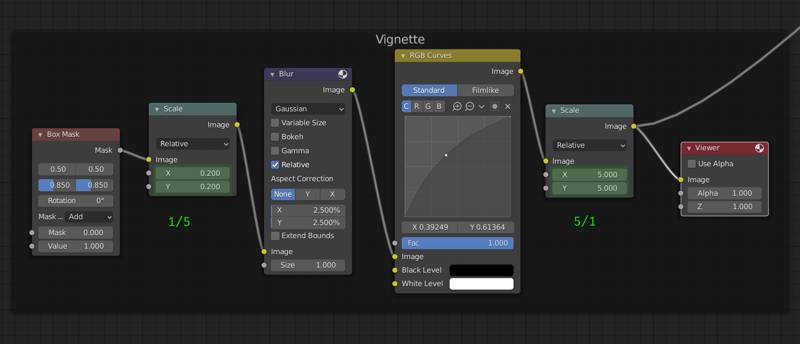
The reason why we are scaling the mask down and then back up is because I feel like this makes it apply blur faster than the full size mask. I did not test this at all, so it might as well make it run slower. Feel free to remove both scale nodes. The choice of starting with a rectangle shape or ellipse shape is entirely up to you. The only important thing to note here is to keep this effect subtle, just like the lens dispersion and film grain.
That concludes the compositing. You can see a comparison between raw render (with plain black background) and the composited image above. Also here is a list of compositing steps we have covered:
- Nebulae
- Stars
- Dim background around subject.
- Lens dispersion
- Film noise
- Vignette
I hope this was useful for you. I don’t plan on sharing the blend file, I covered everything that makes this project above. It would be a much better learning experience if you do it on your own, than just looking at the finished project file. Your critics and comments are welcome.